
eCommerce Store UI Design – Description
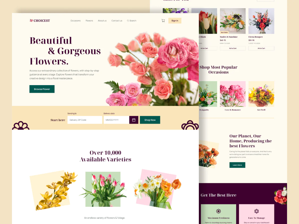
The eCommerce store UI is crafted to deliver a fast, intuitive, and visually appealing shopping experience across all devices. The design strikes a balance between aesthetics and functionality, prioritizing usability, performance, and brand identity.
Key Features:
Homepage Design:
A modern, engaging landing page featuring a hero banner with promotions or featured collections. Below, dynamic product carousels, category previews, and trust-building elements like testimonials and brand badges enhance first impressions.
Product Listings:
Grid-based layouts allow users to browse by category or search results. Cards display product images, pricing, discounts, star ratings, and quick action buttons like “Add to Cart” or “Quick View.” Filters and sorting options help narrow down choices efficiently.
Product Detail Page:
Each product page includes high-resolution images with zoom, detailed descriptions, size/color variants, shipping info, reviews, and a prominent “Buy Now” or “Add to Cart” button. Related products and upsell suggestions appear below.
Shopping Cart & Checkout:
A seamless cart drawer for quick edits and a multi-step checkout flow designed for clarity and speed. Includes progress indicators, shipping options, discount code input, multiple payment methods, and order summary. Trust badges and user reviews enhance confidence.
User Account & Orders:
A personalized dashboard allows users to view order history, track deliveries, manage returns, and update their profile or saved addresses. Wishlist functionality encourages repeat visits.
Search Functionality:
A smart, predictive search bar suggests products, categories, and recent searches in real time, improving discoverability and reducing user effort.
Mobile Responsiveness:
Fully responsive layout optimized for mobile and tablet screens. Sticky navbars, large tap targets, and simplified flows enhance mobile usability.
Design System:
Uses a clean, scalable design system with consistent spacing, typography, and color palettes. CTAs use vibrant accent colors for visibility, while neutral backgrounds keep the focus on the products.
Microinteractions:
Subtle animations (e.g., hover effects, loading spinners, button presses) enhance feedback and create a premium, polished experience.

Read the author's instructions below to know how you can get help.
Contact email: N/A
Phone number: N/A
This item has no comments
Sign In to comment
Subscribe to access unlimited downloads of graphics and more premium assets for your creative needs.

This item was featured on Figtemp
Member since May 2025
Published:
May 31, 2025 03:18 AM
Category:
By AliZain in Web Design