

Smart Business Intelligence Dashboard UI/UX
Project Overview
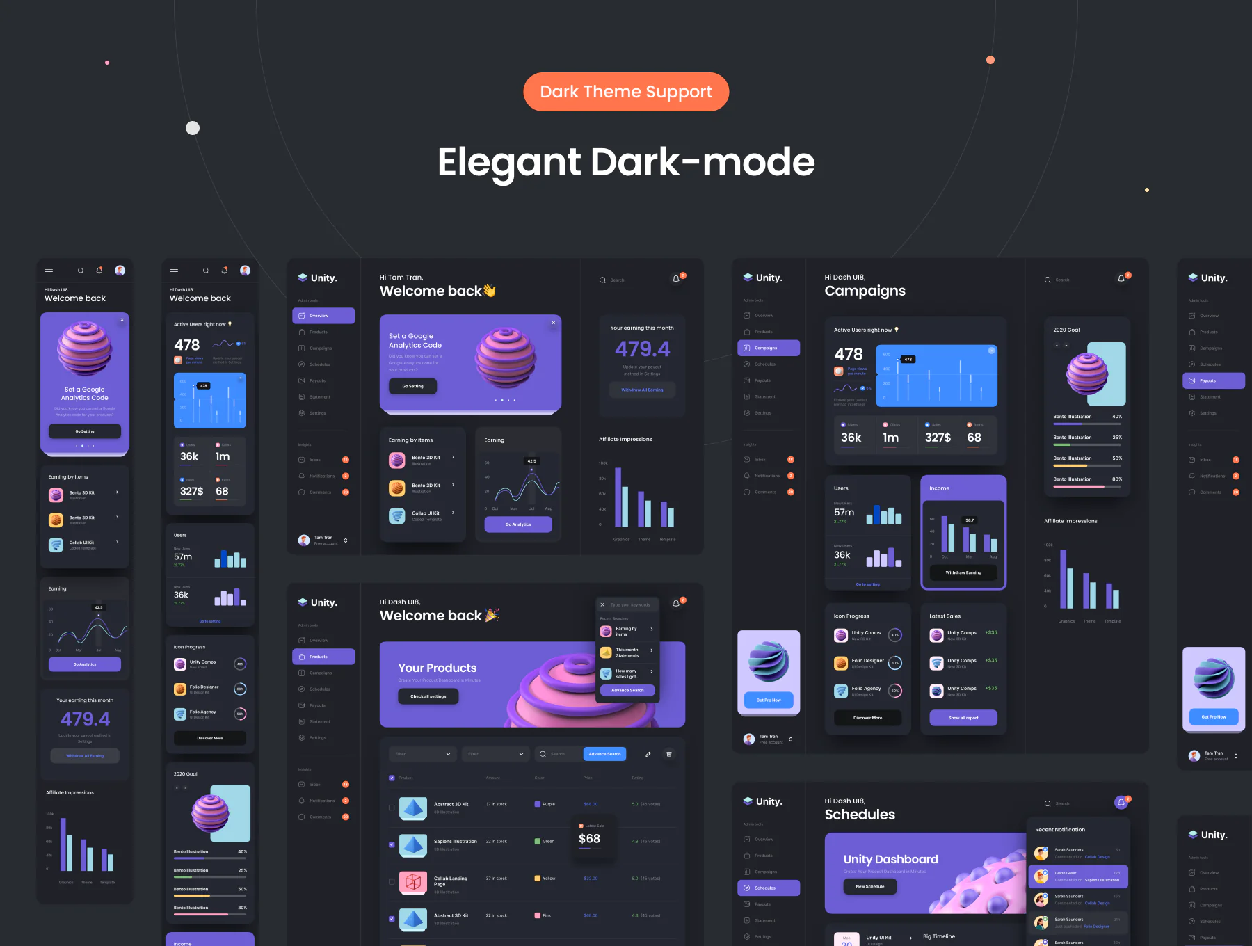
DarkDash is a sleek, professional-grade dark mode dashboard UI designed for modern business analytics and intelligence systems. The dashboard consolidates complex business operations into a visually digestible, interactive platform—allowing users to gain insights, monitor key performance indicators, and manage tasks seamlessly.
This design is ideal for enterprise teams, startups, and data-driven organizations seeking both functionality and elegance in a digital workspace.
Key Features
🌒 Dark Mode Aesthetic
With a sleek black and charcoal interface accented by vibrant UI highlights (blue, green, red, and purple), DarkDash offers a visually comfortable experience, ideal for extended use and low-light environments.
📊 Advanced Analytics & KPIs
The dashboard includes a wide array of analytics components:
Revenue metrics
User engagement
Sales trends
Conversion rates
Performance comparison graphs (line, bar, radial, pie)
These modules are neatly separated and color-coded for intuitive understanding.
🧭 Streamlined Navigation
A well-structured left sidebar menu gives users quick access to sections like:
Overview
Sales
Analytics
Transactions
Orders
Products
Customers
Reports
Settings
Notifications
Navigation patterns follow established UX best practices for dashboard usability.
📈 Interactive Data Visualization
Dynamic charts and graphs are used to represent real-time and historical data:
Line and bar graphs for trends
Pie and donut charts for categorical distribution
Stat cards with mini visual indicators
Tables with sorting and status chips
🛒 E-commerce-Centric Elements
Includes modules specifically tailored for e-commerce business:
Product tables (name, inventory, price, status)
Order management screens
Customer details and filters
Sales breakdown by region/category
🧾 Invoices & Transactions
Supports structured views for invoices, billing summaries, and transaction logs with filters and export options.
🧑💼 User & Role Management
Profile dropdowns, user avatars, role tags, and permission settings are thoughtfully included—suitable for admin roles, managers, and team members.
📷 Creative Upload & Preview
Creative modules at the end hint at user-generated content or marketing collateral uploads (e.g., 3D illustrations, image previews, drag-and-drop UI)—ideal for collaborative tools or campaign dashboards.
Design Language
Typography: Bold, legible sans-serif fonts that aid in readability across all screen sizes.
Color System: Monochromatic base with vibrant accent colors for quick visual parsing of statuses (green = success, red = error, blue = info, yellow = warning).
Components: Clean, borderless cards with soft shadows and minimal outlines. CTAs are strategically placed to reduce cognitive load.
Grid Layout: Responsive 12-column grid structure to ensure visual alignment and balance throughout.
Tools Used
Figma (primary design and prototyping)

Read the author's instructions below to know how you can get help.
Contact email: N/A
Phone number: N/A
This item has no comments
Sign In to comment
Subscribe to access unlimited downloads of graphics and more premium assets for your creative needs.

This item was featured on Figtemp
Member since May 2025
Published:
May 31, 2025 02:45 AM
Category:
By shanali in App Design